Avoiding the Pitfalls: Common Landing Page Mistakes in Digital Marketing in Nepal
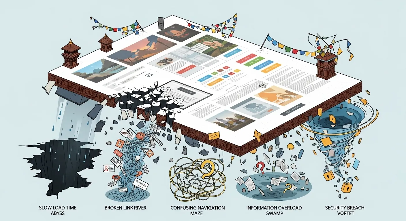
In the competitive world of digital marketing in Nepal, your landing page is a critical asset. It’s the dedicated space designed to convert visitors into leads or customers. However, many Nepali businesses, despite investing in traffic generation, see their efforts fall flat due to common landing page mistakes. These errors can lead to significant conversion optimization problems, frustrating users and wasting valuable marketing budget. For a guide on best practices, see our post on landing page best practices in Nepal.
As a digital marketing professional, I’ve observed recurring user experience issues and design flaws that prevent landing pages from performing optimally. Understanding these pitfalls is the first step towards building high-converting pages that resonate with your Nepali audience and improve your overall digital marketing in Nepal.
Mistake 1: Lack of Message Match
The Problem: The content and offer on your landing page don’t align with the ad, email, or link that brought the user there. There’s a disconnect between what was promised and what’s delivered.

The Impact: High bounce rates, confusion, and a feeling of being misled. Users quickly leave if they don’t immediately see what they expected.
How to Avoid It:
- Consistency is Key: Ensure your landing page headline, imagery, and offer directly reflect the ad copy or source material.
- Specific Landing Pages: Create unique landing pages for each specific campaign or ad group to ensure perfect message match.
Mistake 2: Cluttered Design and Too Many Distractions
The Problem: Overwhelming the user with too much information, too many images, or too many links. Including main website navigation on a landing page is a common culprit.
The Impact: Users get distracted, confused, and don’t know what action to take. This leads to low conversion rates.
How to Avoid It:
- Single Goal: Design your landing page with one clear, primary conversion goal. For more on this, see our CRO guide.
- Minimalism: Remove all unnecessary elements, links, and navigation that don’t contribute to the conversion goal.
- Ample White Space: Give your content room to breathe. White space improves readability and focuses attention.
graph TD
    A["Start: Landing Page Design"] --> B{Define Single Goal?};
    B -- Yes --> C[Remove Distractions (Nav, Extra Links)];
    B -- No --> D["Re-evaluate Purpose"];
    C --> E[Incorporate Ample White Space];
    E --> F[Prominent, Clear CTA];
    F --> G["End: Optimized Landing Page"];
    D --> A;
Figure 1: Flow for a Clean Landing Page Design
Mistake 3: Weak or Unclear Call-to-Action (CTA)
The Problem: Your CTA is hard to find, uses generic language, or doesn’t clearly tell the user what to do next.
The Impact: Users don’t know what action you want them to take, leading to missed conversions.
How to Avoid It:
- Prominent Placement: Make your CTA button stand out with contrasting colors and ample white space. Place it “above the fold” (visible without scrolling) and repeat it if the page is long.
- Action-Oriented Language: Use strong verbs that clearly state the action (e.g., “Get Your Free Guide,” “Shop Now,” “Book a Consultation”). For more on CTAs, see our CRO guide.
- Single CTA: Focus on one primary action per landing page.
Mistake 4: Poor Mobile Optimization
The Problem: Designing for desktop first and treating mobile as an afterthought, despite the vast majority of internet users in Nepal accessing the web via mobile devices.
The Impact: Slow loading times, difficult navigation, tiny text, and non-responsive forms on mobile devices lead to high bounce rates and frustrated users. This directly translates to lost conversions and significant user experience issues.
How to Avoid It:
- Mobile-First Design: Always design and optimize your website and landing pages for mobile devices first.
- Speed Optimization: Compress images, leverage browser caching, and minimize code to ensure lightning-fast loading times on mobile networks.
- Simplified Forms: Keep forms short and easy to fill out on a small screen. Use auto-fill where possible.
Mistake 5: Lack of Trust Signals
The Problem: Failing to include elements that build trust and credibility, especially crucial for online transactions in Nepal.
The Impact: Users are hesitant to provide personal information or make a purchase if they don’t trust your brand. This leads to high abandonment rates.
How to Avoid It:
- Testimonials & Reviews: Feature authentic testimonials from satisfied Nepali customers.
- Trust Badges: Display security seals (SSL, payment gateway logos), privacy policy links, and money-back guarantees.
- Client Logos: If you work with well-known local businesses, display their logos.
- Clear Contact Information: Make it easy for users to contact you if they have questions.
Mistake 6: Not A/B Testing
The Problem: Making assumptions about what will work best instead of systematically testing different elements of your landing page.
The Impact: You might be leaving conversions on the table or even implementing changes that negatively impact performance. Without testing, you’re guessing.
How to Avoid It:
- Formulate Hypotheses: Before making any change, clearly state what you expect to happen and why.
- A/B Test Everything: Use A/B testing tools to compare different versions of your pages, headlines, CTAs, images, and forms. Let data, not assumptions, guide your decisions. Be aware of A/B testing challenges in Nepal.
- Ensure Statistical Significance: Don’t make decisions based on small sample sizes or short test durations. Ensure your results are statistically significant.
graph TD
    A["Start: Identify Element for Test"] --> B[Formulate Hypothesis];
    B --> C[Create Variations (A vs. B)];
    C --> D["Run Test with A/B Testing Tool"];
    D --> E{Results Statistically Significant?};
    E -- Yes --> F[Implement Winning Variation];
    E -- No --> G["Continue Testing or Re-evaluate Hypothesis"];
    F --> H["End: Conversion Optimized"];
    G --> A;
Figure 2: The A/B Testing Process for Conversion Optimization
Final Thoughts
Avoiding these common landing page mistakes in Nepal is crucial for any business aiming for sustainable growth. By prioritizing clear messaging, clean design, mobile optimization, strong trust signals, and continuous A/B testing, you can transform your landing pages into powerful conversion engines, driving more leads and sales and contributing significantly to your digital marketing Nepal success.
Mistake 1: Lack of Message Match
The Problem: The content and offer on your landing page don’t align with the ad, email, or link that brought the user there. There’s a disconnect between what was promised and what’s delivered.
The Impact: High bounce rates, confusion, and a feeling of being misled. Users quickly leave if they don’t immediately see what they expected.
How to Avoid It:
- Consistency is Key: Ensure your landing page headline, imagery, and offer directly reflect the ad copy or source material.
- Specific Landing Pages: Create unique landing pages for each specific campaign or ad group to ensure perfect message match.
Mistake 2: Cluttered Design and Too Many Distractions
The Problem: Overwhelming the user with too much information, too many images, or too many links. Including main website navigation on a landing page is a common culprit.
The Impact: Users get distracted, confused, and don’t know what action to take. This leads to low conversion rates.
How to Avoid It:
- Single Goal: Design your landing page with one clear, primary conversion goal. For more on this, see our CRO guide.
- Minimalism: Remove all unnecessary elements, links, and navigation that don’t contribute to the conversion goal.
- Ample White Space: Give your content room to breathe. White space improves readability and focuses attention.
Mistake 3: Weak or Unclear Call-to-Action (CTA)
The Problem: Your CTA is hard to find, uses generic language, or doesn’t clearly tell the user what to do next.
The Impact: Users don’t know what action you want them to take, leading to missed conversions.
How to Avoid It:
- Prominent Placement: Make your CTA button stand out with contrasting colors and ample white space. Place it “above the fold” (visible without scrolling) and repeat it if the page is long.
- Action-Oriented Language: Use strong verbs that clearly state the action (e.g., “Get Your Free Guide,” “Shop Now,” “Book a Consultation”). For more on CTAs, see our CRO guide.
- Single CTA: Focus on one primary action per landing page.
Mistake 4: Poor Mobile Optimization
The Problem: Designing for desktop first and treating mobile as an afterthought, despite the vast majority of internet users in Nepal accessing the web via mobile devices.
The Impact: Slow loading times, difficult navigation, tiny text, and non-responsive forms on mobile devices lead to high bounce rates and frustrated users. This directly translates to lost conversions and significant user experience issues.
How to Avoid It:
- Mobile-First Design: Always design and optimize your website and landing pages for mobile devices first.
- Speed Optimization: Compress images, leverage browser caching, and minimize code to ensure lightning-fast loading times on mobile networks.
- Simplified Forms: Keep forms short and easy to fill out on a small screen. Use auto-fill where possible.
Mistake 5: Lack of Trust Signals
The Problem: Failing to include elements that build trust and credibility, especially crucial for online transactions in Nepal.
The Impact: Users are hesitant to provide personal information or make a purchase if they don’t trust your brand. This leads to high abandonment rates.
How to Avoid It:
- Testimonials & Reviews: Feature authentic testimonials from satisfied Nepali customers.
- Trust Badges: Display security seals (SSL, payment gateway logos), privacy policy links, and money-back guarantees.
- Client Logos: If you work with well-known local businesses, display their logos.
- Clear Contact Information: Make it easy for users to contact you if they have questions.
Mistake 6: Not A/B Testing
The Problem: Making assumptions about what will work best instead of systematically testing different elements of your landing page.
The Impact: You might be leaving conversions on the table or even implementing changes that negatively impact performance. Without testing, you’re guessing.
How to Avoid It:
- Formulate Hypotheses: Before making any change, clearly state what you expect to happen and why.
- A/B Test Everything: Use A/B testing tools to compare different versions of your pages, headlines, CTAs, images, and forms. Let data, not assumptions, guide your decisions.
- Ensure Statistical Significance: Don’t make decisions based on small sample sizes or short test durations. Ensure your results are statistically significant.
Final Thoughts
Avoiding these common landing page mistakes in Nepal is crucial for any business aiming for sustainable growth. By prioritizing clear messaging, clean design, mobile optimization, strong trust signals, and continuous A/B testing, you can transform your landing pages into powerful conversion engines, driving more leads and sales and contributing significantly to your digital marketing Nepal success.
Related Posts and Resources
- Digital Marketing in Nepal (Complete Guide)
- Google Ads in Nepal: Practical Strategy
- SEO Analytics for Nepali Businesses
- eCommerce Analytics Setup in Nepal
- eCommerce Metrics That Matter
- Email Marketing Guide for Nepal
- Email Marketing ROI in Nepal
- Facebook Ads Budget Guide (Nepal)
- Cultural PPC Strategy for Nepal
- Competitor Analysis Framework for Nepal